%20--%3e%3csvg%20version='1.1'%20id='Layer_1'%20xmlns='http://www.w3.org/2000/svg'%20xmlns:xlink='http://www.w3.org/1999/xlink'%20x='0px'%20y='0px'%20viewBox='0%200%2031.9%2032'%20style='enable-background:new%200%200%2031.9%2032;'%20xml:space='preserve'%3e%3cstyle%20type='text/css'%3e%20.st0{fill:%230D7BBA;}%20%3c/style%3e%3cg%3e%3cg%3e%3cg%3e%3cg%3e%3cg%3e%3cpolyline%20class='st0'%20points='17.6,26.6%2029.4,14.8%2031.9,17.2%2017.6,31.5%205.1,18.9%207.5,16.4%20'/%3e%3c/g%3e%3c/g%3e%3c/g%3e%3cg%3e%3cg%3e%3cg%3e%3cpolygon%20class='st0'%20points='26.8,12.7%2017.7,21.8%2015.3,19.3%2021.9,12.7%2019.4,10%2012.6,16.7%2010.2,14.3%2016.8,7.6%2014.3,5%202.5,16.7%200,14.3%2014.3,0.1%20'/%3e%3c/g%3e%3c/g%3e%3c/g%3e%3c/g%3e%3c/g%3e%3c/svg%3e)
Jewelry E-commerce — An Elegant Storefront for a Boutique Brand
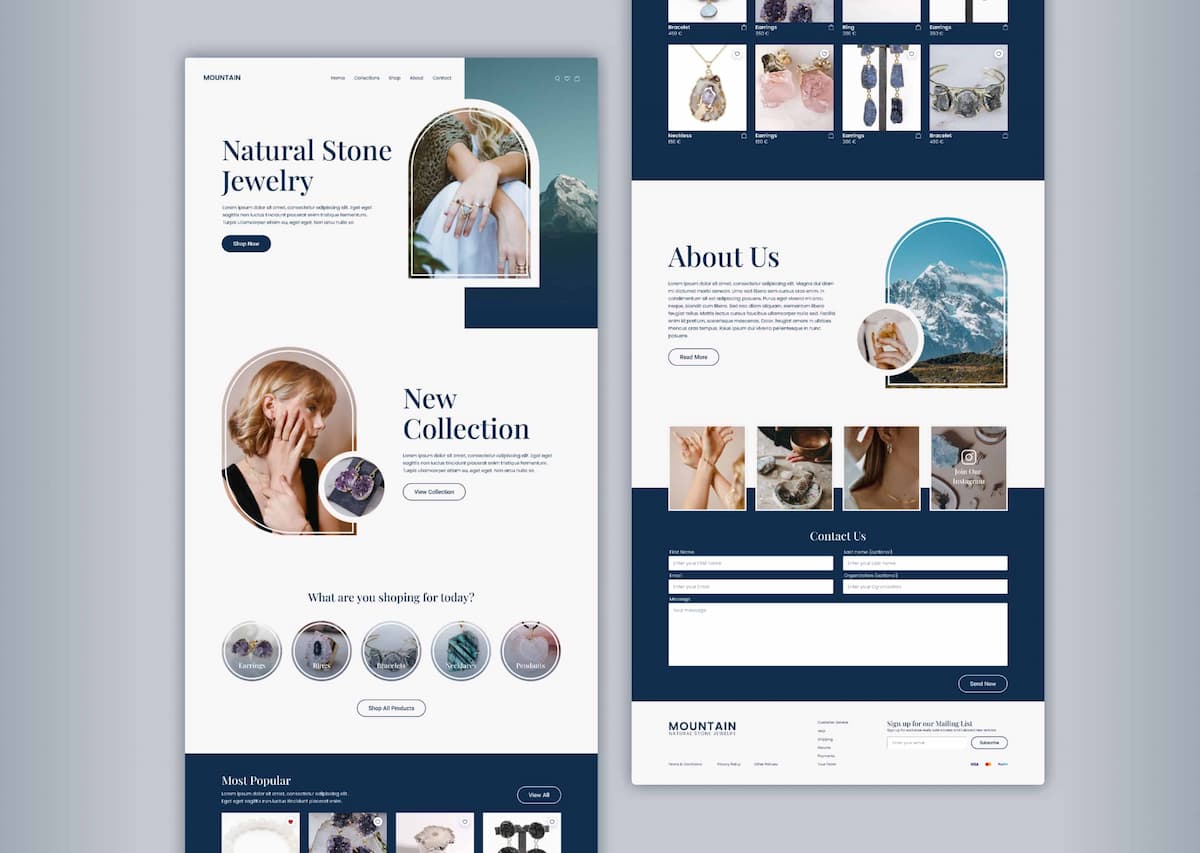
An elegant storefront for a boutique jewelry brand, using arched imagery and refined type to spotlight new collections. Guided navigation and trust sections support discovery and purchase.
Overview
Designed as a premium homepage for a boutique jewelry brand. Arched image treatments, refined typography, and a warm color palette elevate the visual language while clear product categories and trust signals guide visitors from browsing to purchase with confidence. The goal was to create a digital storefront that feels as luxurious and curated as the jewelry itself.
My Role
- UX / UI Design
- Visual Design & Art Direction
- Content & Structure
- Interaction Design
- Assets / Handoff
Key Features
Arched imagery & refined type
Elegant visual treatments that create a premium feel and draw attention to featured collections and pieces.
Collection spotlight
Dedicated sections for new arrivals and featured collections, making it easy to discover curated product groupings.
Trust & credibility sections
Testimonials, quality guarantees, and brand story elements that build confidence in the purchasing decision.
Guided navigation
Clear category structure and CTAs that lead visitors naturally from discovery to product pages and checkout.
Warm color palette
A carefully chosen palette that complements the jewelry photography and creates an inviting, luxurious atmosphere.
Responsive layout
Optimized for mobile and tablet with consistent visual quality and smooth browsing across all screen sizes.
Screenshots
Tech Stack
Final Thoughts
This project was an exercise in translating luxury and craftsmanship into a digital experience. Every visual decision — from the arched frames to the type choices — was made to reflect the care and elegance of the jewelry. The result is a homepage that feels polished, trustworthy, and inviting, encouraging visitors to explore and ultimately purchase.
Want to see it live?