%20--%3e%3csvg%20version='1.1'%20id='Layer_1'%20xmlns='http://www.w3.org/2000/svg'%20xmlns:xlink='http://www.w3.org/1999/xlink'%20x='0px'%20y='0px'%20viewBox='0%200%2031.9%2032'%20style='enable-background:new%200%200%2031.9%2032;'%20xml:space='preserve'%3e%3cstyle%20type='text/css'%3e%20.st0{fill:%230D7BBA;}%20%3c/style%3e%3cg%3e%3cg%3e%3cg%3e%3cg%3e%3cg%3e%3cpolyline%20class='st0'%20points='17.6,26.6%2029.4,14.8%2031.9,17.2%2017.6,31.5%205.1,18.9%207.5,16.4%20'/%3e%3c/g%3e%3c/g%3e%3c/g%3e%3cg%3e%3cg%3e%3cg%3e%3cpolygon%20class='st0'%20points='26.8,12.7%2017.7,21.8%2015.3,19.3%2021.9,12.7%2019.4,10%2012.6,16.7%2010.2,14.3%2016.8,7.6%2014.3,5%202.5,16.7%200,14.3%2014.3,0.1%20'/%3e%3c/g%3e%3c/g%3e%3c/g%3e%3c/g%3e%3c/g%3e%3c/svg%3e)
Homewares Shop — A Clean, Product-First Layout for Modern Home Goods
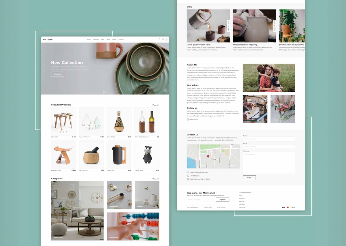
Clean, product-first layout for modern home goods. Lifestyle photography, structured categories, and a minimal grid reduce friction and keep attention on the catalog.
Overview
A modern e-commerce homepage designed for a homewares brand. The layout prioritizes products over decoration — lifestyle photography, structured categories, and a clean grid system reduce visual noise and keep shoppers focused on the catalog. The design supports effortless browsing and encourages exploration across product categories.
My Role
- UX / UI Design
- Visual Design
- Content & Structure
- Interaction Design
- Assets / Handoff
Key Features
Product-first layout
A minimal grid that puts products center stage, reducing visual clutter and letting items sell themselves.
Lifestyle photography
Contextual imagery that shows products in real settings, helping shoppers envision items in their own spaces.
Structured categories
Clear, well-organized product groupings that make it easy to navigate the catalog and find what you need.
Minimal, clean grid
A balanced layout with generous whitespace that keeps the browsing experience calm and focused.
Featured collections
Curated product highlights and seasonal picks that encourage exploration beyond initial search intent.
Responsive layout
Optimized for mobile shopping with touch-friendly interactions and consistent visual quality on all devices.
Screenshots
Tech Stack
Final Thoughts
This project focused on letting products speak for themselves. By stripping away unnecessary decoration and building a clean, grid-based layout, the design creates a calm shopping experience that keeps attention where it belongs — on the catalog. The result is a homepage that feels modern, approachable, and easy to browse.
Want to see it live?